Defining a Grid
We set the display property of any element to grid, and that element becomes the grid container and all it's children become grid items.
I want my grid to be 2 by 2. To set the rows I've used the grid-template-rows property, and to specify how many columns should be in the grid I've used grid-template-columns.
The size can be specified in any unit (e.g. pixels, percentages, viewport units, 1fr).
The fr Unit (fraction)
- Is a unit defined for Grid Layout
- It divides the space into a fraction of the available space
The repeat() function
Lets us specify a large number of columns or rows that follow a pattern.
The grid-template property
Shorthand property for specifying both the grid-template-rows and grid-template-columns.
Concepts and Terminology
- Grid Container (aka. parent container)
- Child Elements (aka. grid items)
- Grid Lines
- Grid Tracks
- Grid Cells
- Grid Areas
- Explicit Grid and Implicit Grid
Grid Lines
- Are the horizontal and vertical lines that form the basis of the grid structure.
- Are used to position items on the grid
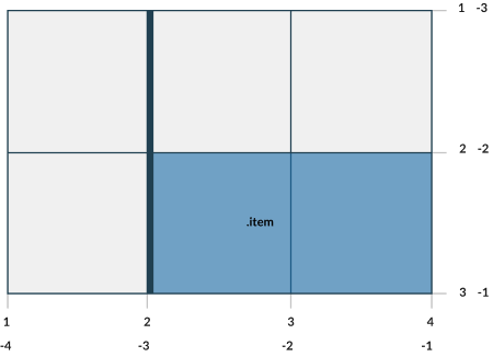
- Refer to them by numerical index, starts at 1
- Grid lines have negative indices, we can reference grid lines starting from the end of the grid
- We can name the grid lines so we don't have to count which grid line you need to reference
👀 Sneak Peak at the layout below. Try resizing the window
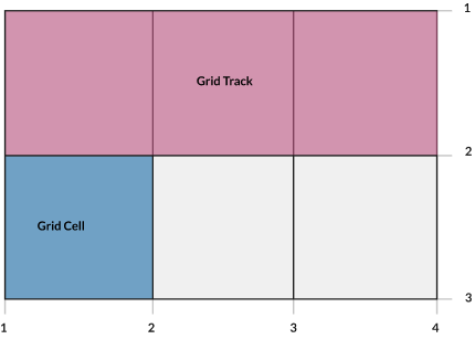
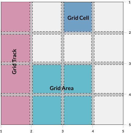
Grid Tracks and Grid Cells
- A grid track is the space between 2 adjacent grid lines.
- We have the ability to separate grid-tracks with gutters, using
grid-row-gap and grid-column-gap properties - The grid cell is the space between 2 adjacent row grid lines and 2 adjacent column grid lines. You can think of it as a table cell.
Grid Areas
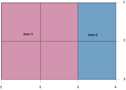
- A grid area is made up of 1 or more grid cells
- Is bound by 4 grid lines on each side of the grid area.
- To define a grid area use the
grid-template-areas property - A grid item can be assigned to a grid area using:
grid-areagrid-row, grid-row-start, grid-row-endgrid-column, grid-column-start, grid-column-end
👀 Sneak Peak: Grid Areas + CSS Variables + media queries = 😍
What about some gutters?
The gutters between grid tracks can be controlled with grid-row-gap, grid-column-gap and grid-gap
Properties defined on the Grid Container Recap
gridgrid-template-columnsgrid-template-rowsgrid-templategrid-template-areasgrid-gapgrid-column-gapgrid-row-gap
Some examples:
Explicit and Implicit Grid
The explicit grid is what we define using the CSS properties like grid-template-rows, grid-template-columns and grid-template-areas
Q: But what happens if we place an item outside the grid?
- A: The browser will create an implicit grid to hold that item.
- We can specify the values of these implicit grid tracks by using
grid-auto-columns and grid-auto-rows properties - If these properties are not set, their default values is auto
- If they don't have any content, they will have a height of 0
Sizing a Grid Track
- Can be a CSS length, like 100px
- Can be a percentage, like 10%
- Can be a flexible length, declared using the
fr unit min-contentmax-contentauto- A range defined my the
minmax()function fit-content
Keywords: auto-fill, auto-fit and dense
Keyword: auto-fill
- Fill the axis (row or column) with the most numbers of grid tracks without overflowing
- It creates grid tracks even though they may not be filled with cells.
Keyword: auto-fit
- Behaves as
auto-fill - Except it collapses all empty repeated tracks.
Keyword: dense and the grid-auto-flow property
grid-auto-flow allows us to adjust how the automatic placement of grid items work when they are not explicitly positioned with any grid-placement properties.
grid-auto-flow: [ row | column ] | dense
-
row: The auto-placement algorithm will place grid items by filling each row and add new rows as needed. -
column: The auto-placement algorithm will place grid items by filling each column and add new columns as needed. -
dense: The algorithm will attempt to fit smaller grid items that appear later in the source order earlier in the grid. - This will minimise the "holes" in the grid
- If not specified, the browser will default to the "sparse" algorithm - the grid will be filled up in order, never back-tracking. A big possibility of introducing "holes" in the grid.
Properties for the Children (Grid Items)
-
grid-column-start, grid-column-end , grid-row-start, grid-row-end -
grid-column, grid-row shorthand for grid-column-start and grid-column-endgrid-row-start and grid-row-end
grid-areajustify-selfalign-selfplace-selfjustify-itemsalign-itemsplace-itemsjustify-contentalign-contentplace-content
grid-column-start, grid-column-end , grid-row-start, grid-row-end
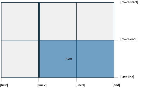
- Determines a grid item's location within the grid by referring to specific grid lines.
- Values:
-
<line>number to refer to a numbered grid line, or a name to refer to a named grid line span <number>- the item will span across the provided number of grid tracks-
span <name>- the item will span across until it hits the next line with the provided name auto – indicates auto-placement, an automatic span, or a default span of one
justify-self
align-self
place-self
place-self sets both the align-self and justify-self properties in a single declaration.
justify-items
Aligns grid items along the row axis. This value applies to all grid items inside the container.
align-items
Aligns grid items along the column axis. This value applies to all grid items inside the container.
place-items
place-items sets both the align-items and justify-items properties in a single declaration.
justify-content
This property aligns the grid along the row axis.
startendcenterstretchspace-aroundspace-betweenspace-evenly
align-content
This property aligns the grid along the column axis.
startendcenterstretchspace-aroundspace-betweenspace-evenly
place-content
place-content sets both the align-content and justify-content properties in a single declaration.
Notes
- float, display: inline-block, display: table-cell, vertical-align and column-* properties have no effect on a grid item.
display: inline-grid- CSS Grid uncollapses the margins
@supportsubgrid
🤯 What about some examples?